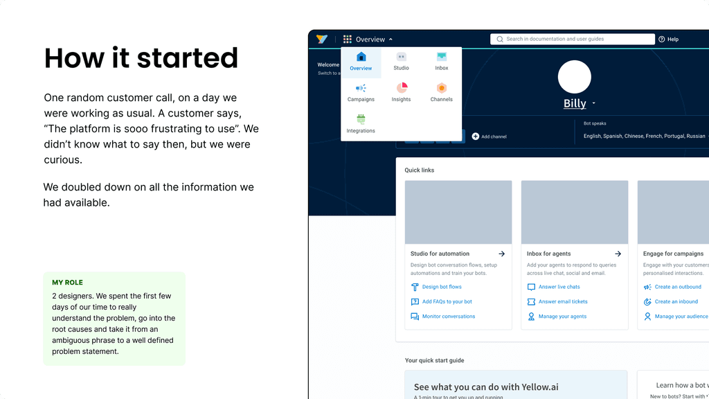
Building the navigation 2.0

PROBLEM STATEMENT

Re-designing the platform's navigation to solve issues related to user effort, discoverability and onboarding.

Role

Product design

Time

1 month

Team

8 people

Industry

Enterprise SaaS

Quick summary

⭐ HIGHLIGHTS
  1. This was initiated solely by design team, so getting a buy in from the leadership was difficult as it was a big overhaul.

  2. We were 8 people, 2 designers, 6 devs. We had to be our own PMs, planning sprints, writing PRDs, getting a team, owning the shipping, marketing, onboarding etc.

✅ SOLUTION
  1. The navigation IA and hierarchy was changed from a switcher component within a Top-Left-Top to Left-Left-Top arrangement, completely revamping it.

  2. Certain pages were re-designed and moved within the platform to increase their accessibility and usability.

✅ SOLUTION
  1. The navigation IA and hierarchy was changed from a switcher component within a Top-Left-Top to Left-Left-Top arrangement, completely revamping it.

  2. Certain pages were re-designed and moved within the platform to increase their accessibility and usability.

✅ SOLUTION
  1. The navigation IA and hierarchy was changed from a switcher component within a Top-Left-Top to Left-Left-Top arrangement, completely revamping it.

  2. Certain pages were re-designed and moved within the platform to increase their accessibility and usability.

✅ SOLUTION
  1. The navigation IA and hierarchy was changed from a switcher component within a Top-Left-Top to Left-Left-Top arrangement, completely revamping it.

  2. Certain pages were re-designed and moved within the platform to increase their accessibility and usability.

🎯 RESULT
  1. We saw 50% reduction in number of clicks instantly, and 52% reduction in avg. time measured by keystroke level model.

  2. The findability of modules, features etc increased by 22% which led to further goal completion and reduced drop-off.

🎯 RESULT
  1. We saw 50% reduction in number of clicks instantly, and 52% reduction in avg. time measured by keystroke level model.

  2. The findability of modules, features etc increased by 22% which led to further goal completion and reduced drop-off.

🎯 RESULT
  1. We saw 50% reduction in number of clicks instantly, and 52% reduction in avg. time measured by keystroke level model.

  2. The findability of modules, features etc increased by 22% which led to further goal completion and reduced drop-off.

🎯 RESULT
  1. We saw 50% reduction in number of clicks instantly, and 52% reduction in avg. time measured by keystroke level model.

  2. The findability of modules, features etc increased by 22% which led to further goal completion and reduced drop-off.

Protected under NDA

Please reach out to me for the password

Some effort in one direction is better than all effort in no direction